
Challenge Coin Plating: Gold, Silver, Antique & Black Nickel Compared
Challenge coin plating decides the metal tone that sits behind your enamel colours, and the choice is more practical than decorative. Antique gold and antique silver suit traditional unit coins, bright finishes suit display pieces, and black nickel gives maximum contrast with a single bright colour. This guide compares each option on durability, photography and compatibility with enamel, so you can choose before the die is cut.
Plating is usually picked late in the design process, which is a mistake. It changes how much contrast your enamel needs, how visible the relief becomes, and how the coin ages in a pocket. A thoughtful choice at the artwork stage makes the rest of the design easier. For the full specification path, start with our custom challenge coins buyer’s guide.
Challenge Coin Plating Options Compared
| Plating | Appearance | Best for | Enamel pairing | Wear behaviour |
|---|---|---|---|---|
| Antique gold | Warm metal with darkened recesses | Traditional unit and military-style coins | Red, navy, deep green, white | Dark recesses hide handling marks well |
| Antique silver | Cool metal with darkened recesses | Police and fire coins, heritage themes | Blue, teal, black, bright red | Good concealment of marks; neutral backdrop |
| Bright gold | Reflective, mirror-like | Presentation and retirement coins | Few colours, simple emblem | Shows fingerprints and fine scratches |
| Bright silver | Clean, reflective, neutral | Formal commemorative pieces | Single strong accent colour | Shows handling; best in a case |
| Black nickel | Dark gunmetal with a matte edge | Tactical, modern and special-unit themes | One or two bright colours; white reads strongly | Very forgiving of daily carry |
| Copper / brass tone | Warm reddish or yellow metal | Fire-service, heritage and anniversary issues | Earth tones, black, cream | Develops a natural patina over time |
There is no universally best finish. The right one depends on where the coin lives — in a pocket, on a desk or in a display case — and on the colours you need to show. The sections below make the trade-offs concrete.
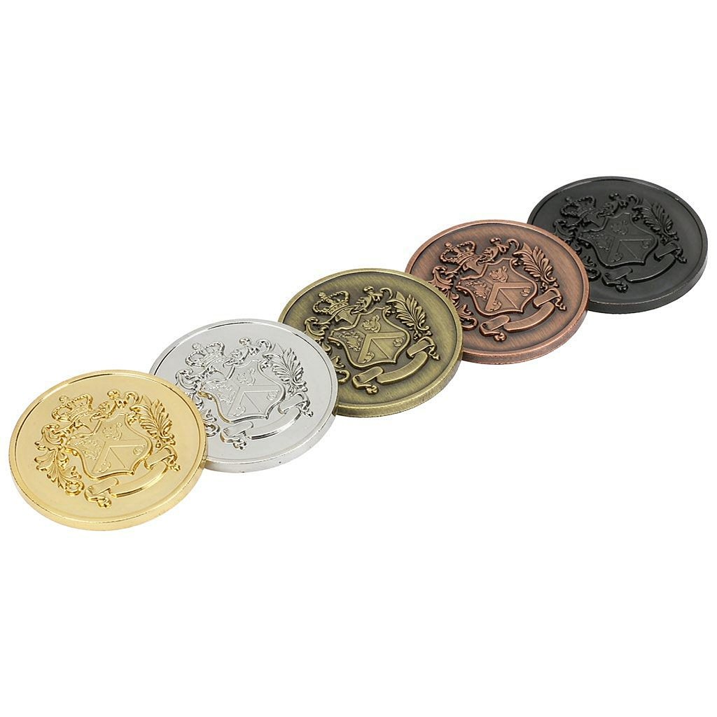
Antique Gold: The Traditional Default
Antique gold is the most common choice for unit coins, and for good reason. The plating is applied and then a darkening agent settles into the recessed areas of the die, which makes raised relief stand out without relying on colour. A crest with layered detail reads clearly because the low points recede visually.
It is also the most forgiving finish for a carried coin. The dark recesses mask the small scratches that accumulate in a pocket, so a coin still looks composed after a year of handling. Warm tones pair naturally with red, navy, deep green and white enamel — the palette of most department and military insignia.
If you are unsure where to start, antique gold is the safe answer. It suits traditional imagery, tolerates imperfect artwork better than bright finishes and photographs well under varied lighting.
Antique Silver: Neutral and Cool
Antique silver gives the same recessed contrast in a cooler tone. It suits departments whose insignia lives in silver and blue, and it works particularly well with fire-service and heritage themes where a warm gold would clash with the existing metal.
Because it is visually neutral, antique silver lets enamel colours carry more of the design. Blue, teal and bright red read strongly against it. If your patch has a large silver or grey element, matching the coin plating to it makes the two feel like one family.
Bright Gold and Bright Silver: For the Display Case
Bright finishes are polished and reflective. They look striking in a proof and in a photograph taken under controlled light, which is why they are often chosen for retirement, command and anniversary pieces. The metal reads as formal and deliberate.
The trade-off is practical. A mirror surface shows fingerprints, fine scratches and any imperfection in the underlying metal. A coin that is carried daily will lose its mirror quality quickly. On a hard-enamel piece kept in a fitted box, the finish stays intact and looks excellent for years.
Our guidance: choose bright plating for presentation coins that will be displayed, and antique plating for coins that will be carried. If a single design serves both roles, antique is the more durable choice.
Black Nickel: High Contrast, Modern
Black nickel is the most distinctive option in the standard range. It produces a dark gunmetal face that makes bright enamel colours pop — white in particular reads almost luminous against it. The finish suits tactical units, special operations themes and modern corporate anniversary coins.
It is also highly practical for daily carry. Surface marks blend into the dark tone instead of catching the eye, and the coin keeps a consistent look over years of handling. The design constraint is colour count: black nickel works best with one or two strong colours rather than a busy multi-colour composition, which can look uneven against the dark base.
Copper and Brass Tones: Selective Uses
Warm copper and brass tones are less common but effective in the right context. Fire-service coins with a heritage theme, anniversary issues and designs built around earth tones all benefit from the warmer base. These finishes develop a natural patina over time, which some owners consider part of the appeal.
Because the colour is close to some enamel tones, check contrast carefully at the proof stage. A brass plating behind yellow enamel produces a low-contrast face. A darker enamel or a stronger metal border solves it.
How Plating Interacts With Enamel
The plating and the colour fill are not independent decisions. Use this pairing guide to avoid a coin where the metal disappears behind the colour, or the colour fights the metal.
| Plating | Strongest enamel colours | Pair with care |
|---|---|---|
| Antique gold | Navy, red, forest green, white | Yellow and pale cream — close in tone |
| Antique silver | Blue, teal, black, crimson | Light grey, pale silver |
| Bright gold | Black, deep blue, single accent | Multi-colour emblems — the metal gets lost |
| Bright silver | Red, black, single strong accent | White and pale tones |
| Black nickel | White, bright red, orange | Dark blue, dark green, brown |
| Copper / brass | Black, cream, deep red | Yellow, orange and other warm tones |
One rule covers all pairings: aim for contrast between metal and enamel, not harmony. A coin where the enamel and plating sit at the same brightness reads as a flat disc. A coin where one is clearly light and the other clearly dark reads from across a room.
How Plating Interacts With Relief and Edges
Antique finishes work by settling into low points. That means they need real relief to look their best — a shallow, nearly flat design gains little from an antique treatment. If your artwork is mostly text and simple shapes, bright plating will give a cleaner result.
Edges matter too. A rope or reeded edge catches light differently from a flat one, and dark plating makes the edge pattern less visible at a glance. If the edge is a deliberate design element, request it in the same sample as the plating so you can judge them together. The specification options are listed on the custom challenge coins page.
For departments matching an existing coin or badge metal, send a clear photo with the artwork. Our team works with partner factories to match the closest standard finish, and the artwork guide explains what to include in that submission.
Five Questions That Settle the Choice
- Where will the coin live? Pocket means antique or black nickel. Display case allows bright finishes.
- What metal is in the department insignia? Match it if the coin is meant to look like part of the same set.
- How many enamel colours does the design use? Many colours need a neutral base; one or two can take a dark or bright one.
- Does the artwork have real relief? Antique finishes need depth to show their effect.
- Is this a first issue or a reorder? Reorders of an unchanged design should keep the existing finish so the series stays consistent.
See the police and fire challenge coins page for how departments apply this to unit and presentation coins, and the case studies for worked examples.
Verify on a Physical Sample
Plating is the hardest choice to make from a screen. Renderings approximate the tone but cannot reproduce how a bright surface reflects a room, or how an antique finish settles into a specific die. For a first coin, approve a physical sample before the full run and check it under the lighting where the coin will actually be presented — an office, a ceremony hall, a patrol car.
Hold it, look at the recesses, and compare it with the badge or patch it is meant to match. If the sample is not right, changing the plating before tooling is straightforward. Changing it afterwards is not.
Key Takeaways
- Antique gold and antique silver are the practical defaults for carried coins; their darkened recesses hide handling marks.
- Bright gold and bright silver suit display and presentation pieces but show fingerprints and scratches.
- Black nickel gives the strongest contrast with one or two bright enamel colours and wears well in a pocket.
- Match plating to the department’s existing insignia metal when the coin is meant to look like part of a set.
- Antique finishes need real relief to work; judge the final choice on a physical sample, not a rendering.
FAQ
What is the most common challenge coin plating?
Antique gold is the most common, followed closely by antique silver. Both give strong relief definition and conceal the small marks that come from daily carry, which is why they dominate unit coins.
Which plating is most durable for a coin carried every day?
Antique finishes and black nickel are the most forgiving. Their darker tones absorb minor surface marks rather than highlighting them. Bright mirror finishes are beautiful but show handling quickly.
Does plating change the enamel colours?
It changes how they are perceived. A bright metal can wash out pale enamel, while a dark base makes white and red read strongly. Aim for contrast between metal and colour, and check the combination on a physical sample.
Can we match our department’s badge metal exactly?
Usually close, though an exact match depends on the finish already in use. Send a clear photo of the badge or an older coin with your artwork and we will confirm the nearest standard plating at the proof stage.
Should a first coin use a physical sample?
Yes. Plating is the hardest specification to judge on screen. A sample shows how the finish interacts with your particular relief, edges and enamel colours, and lets you change course before tooling begins.
Last updated: November 2026.
Deciding between antique gold, silver and black nickel for an upcoming coin? Request a custom quote with your artwork and we will confirm the sample stages and production window. More finish questions are answered in the challenge coin FAQ.