How to Design a Police or Fire Department Challenge Coin
How to design a police challenge coin starts with the artwork you already own: the department patch or badge. Place that emblem at the centre of the obverse, add unit name and motto around the rim, choose a finish that matches your department’s metals, and approve a digital proof before any die is cut. This guide walks through each step in order, plus the mistakes that stall first-time department coins.
A department coin is not a generic giveaway. It is an object that gets carried for years, handed over in a handshake, and read by people who know exactly what the symbols mean. That raises the bar on accuracy and legibility, and it is why the process below is linear: each decision narrows the next one. For the wider picture on sizes, processes and presentation, see our custom challenge coins buyer’s guide.
How to Design a Police Challenge Coin in Eight Steps
The full sequence looks like this, and it works for a police unit, a fire company or a military element with only minor changes:
- Gather source artwork — patch, badge, unit crest.
- Assign the story to the obverse and reverse.
- Set diameter and thickness.
- Choose the enamel process.
- Choose the plating.
- Build the text hierarchy.
- Set the edge and presentation.
- Approve the digital proof before tooling.
Steps 1, 2 and 6 are the ones departments get wrong. The metal decisions are comparatively mechanical. Focus your time on the artwork and the words.
Step 1: Start With the Patch, Not a Blank Page
Almost every successful department coin begins with existing imagery. The patch, badge or unit crest already carries the symbols your people recognize, and reproducing it faithfully matters more than inventing something new. Ask for the highest-resolution source that exists:
- Vector files first. Ask the unit that commissioned the patch whether an AI, EPS or PDF master exists. Uniform suppliers often retain it.
- High-resolution scan second. If only a physical patch exists, scan it at 600 dpi rather than photographing it. Fabric texture photographed at an angle becomes noise in the die.
- Colour references. Record Pantone or hex values for the patch colours, plus a note on how the metal areas should read.
- Written confirmation of wording. Unit name, motto, dates and any officer names should be supplied as typed text, not read off the artwork by eye.
Our artwork requirements guide lists the exact file formats and resolution thresholds we work with. Send what you have even if it is imperfect — a digital proof will show you where the detail disappears before anything is committed to a die.
Step 2: Decide the Story Before the Layout
A coin has two faces and one job. Assign each face a role before placing a single element:
| Face | Usual content | Design priority |
|---|---|---|
| Obverse (front) | Unit crest or badge, department name, established date | Instant recognition at a glance |
| Reverse (back) | Motto, mission line, memorial or commemorative text, secondary emblem | The reason this coin exists |
| Edge | Rope, reeded, flat or cross-cut | Hand-feel; often the detail people notice last |
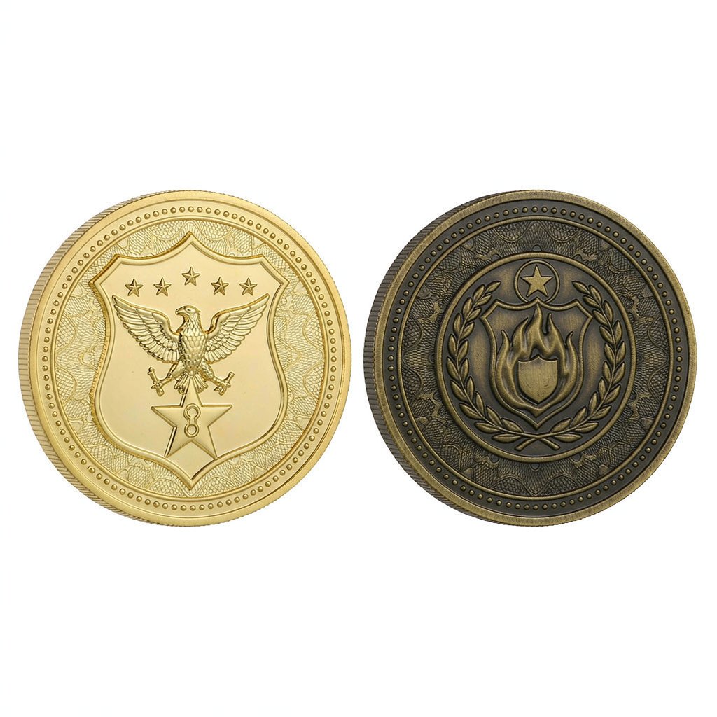
If the coin commemorates one event — a retirement, a deployment, a milestone — that event belongs on the reverse and should be readable without turning the coin over to compare. If it is a general membership coin, the reverse carries the motto and a secondary symbol such as a shield, flame or unit insignia.
Step 3: Set Diameter and Thickness
Diameter controls how much detail survives; thickness controls how the coin feels in the hand. Both are set before the layout is finalized, because a design that fits a 2-inch face may collapse at 1.5 inches.
| Diameter | Typical department use | Text capacity |
|---|---|---|
| 1.5" (38 mm) | Carry coins, youth or school programs, secondary issue | Short motto only; emblem must be simple |
| 1.75" (44 mm) | Unit coins with moderate text, smaller presentations | One circular line plus a short reverse line |
| 2" (50 mm) | The standard for police, fire and military unit coins | Two circular lines, emblem and date comfortably separated |
| 2.25" (57 mm) and up | Command coins, presentation pieces, wall displays | Full crests with fine detail; heavier to carry daily |
Standard thickness is around 3 mm. A 4 mm coin reads as more substantial in a handshake and allows deeper relief, but it is noticeably heavier in a pocket. Departments that hand coins out at graduation often choose 2 inches at standard thickness; command and retirement pieces more often go thicker. The full specification range is on our custom challenge coins page.
Step 4: Choose the Enamel Process
Three processes dominate department work. The right choice depends on how the coin will be used, not on which looks best in a rendering.
| Process | Surface | Best for | Watch-out |
|---|---|---|---|
| Soft enamel | Raised metal borders with recessed colour | Everyday carry coins; strongest colour contrast | Colour sits below the metal line, so fine colour edges need width |
| Hard enamel (cloisonné) | Polished flat, jewelry-like surface | Retirement, command and presentation coins | Requires tighter colour boundaries at the proof stage |
| Die struck | All metal, no colour fill, antique finish | Traditional military-style coins and memorial issues | Relief must carry the whole design; low-contrast emblems can fade |
Soft enamel is the default for a reason: it tolerates imperfect source artwork better than the alternatives and reads clearly under bad lighting. A coin intended for a display case can justify hard enamel. A die-struck piece is a deliberate stylistic choice, usually tied to military tradition.
Step 5: Pick a Plating That Matches the Department
Plating is where a coin starts to feel like it belongs to a specific unit. The safest approach is to match the metals already in the department’s insignia — badge, rank pins, dress uniform buttons — so the coin looks like part of the same family.
- Antique gold. Warm, recessed darkening in the low points. Traditional, and forgiving of everyday handling marks.
- Antique silver. Cooler and more neutral; pairs well with blue and grey patch palettes.
- Bright gold or bright silver. Formal and reflective; best for presentation pieces kept in a case rather than carried daily.
- Black nickel. High contrast with enamel colour, popular with tactical and special-units themes.
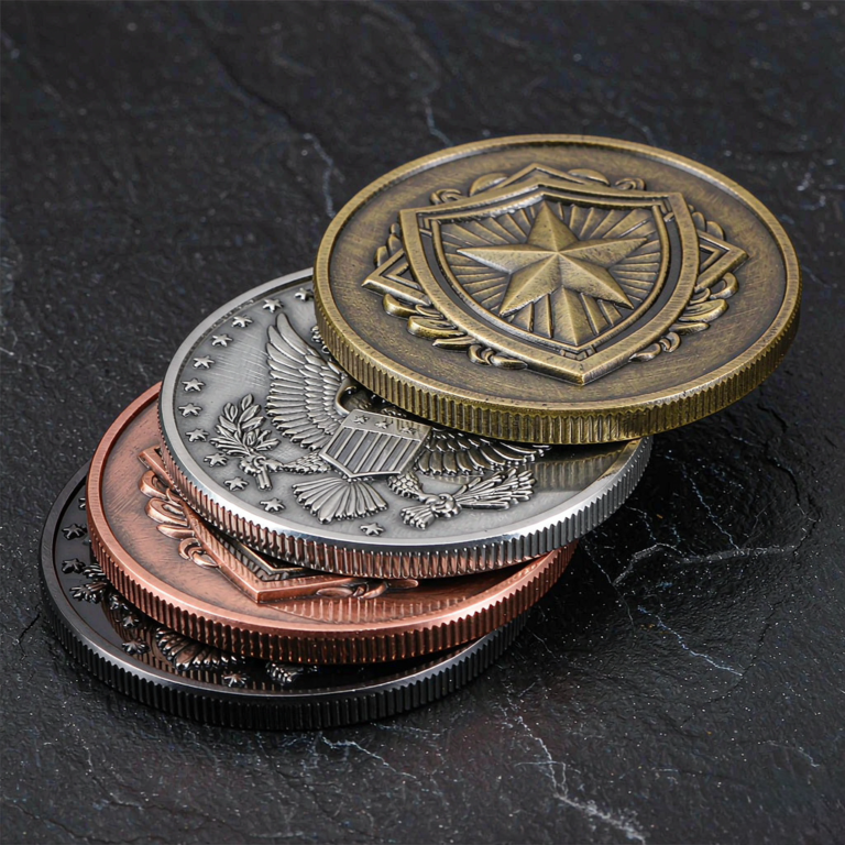
- Copper and brass tones. Used selectively for fire-service and heritage themes where warm metal suits the emblem.
Antique finishes hide handling marks better than mirror-bright ones — a practical point for a coin that lives in a pocket. If the department already has older coins, send a clear photo of one; matching the existing finish is usually more satisfying than choosing a new one in isolation.
Step 6: Build the Text Hierarchy
Text is the part that fails most often. A coin is read at arm’s length, often in a dim room, and the die has physical limits. Set a hierarchy before placing words:
- Primary line: department or unit name. This should be the largest text after the emblem.
- Secondary line: motto or mission statement. Short enough to read in one glance.
- Tertiary line: date, city, commander’s name or event reference.
Keep minimum letter height around 1 mm for raised metal text and avoid ultra-fine serif faces. Sans-serif capitals survive casting best. Curve text along the rim with enough clearance from the edge — letters that sit too close to the border get clipped in the die. Supply all wording as typed text and have two people proofread it; a misspelled unit name is not something a digital proof will catch for you.
Step 7: Edges and Presentation
The edge is small but constant. A rope edge reads as classic unit-coin tradition; a reeded edge feels like currency; a flat edge leaves the most uninterrupted face for the design. Choose it deliberately rather than accepting the default.
Presentation depends on how the coin is given. Bulk issue to a unit works in a protective pouch or capsule. A chief’s coin or retirement piece is usually presented in a fitted display box. Ask for the presentation format at the quote stage so the coin and its container are designed together.
Step 8: Approve the Proof Before Tooling
Nothing is cut until you approve a digital proof. Use it to check four things, in this order: wording, emblem accuracy, colour placement and text size. Then, for a first coin, ask for a physical sample before the full run. A sample resolves the questions a screen cannot — weight, relief depth, how the antique finish settles into the recesses.
We work with partner factories that send checkpoint photos through tooling, sampling, production and packing, so a department can see progress without guessing. You can review examples in our case studies, and the exact wording of the approval stages is covered in the challenge coin FAQ.
Fire Department Coins: What Changes
The eight steps are identical, but fire-service imagery tends to lean on the shield or Maltese cross, the company number, and a department motto with a service or brotherhood theme. Company numbers should be set large enough to read at a distance, and station or battalion identifiers belong on the reverse. Departments that issue both a general coin and company-specific coins usually keep the obverse common and vary only the company number on the reverse — a clean way to maintain a family resemblance across units.
See the police and fire challenge coins page for how the same process adapts to each service.
Common Design Mistakes to Avoid
- Crowding the rim. Three lines of curved text plus an inner border leaves no breathing room. Two lines is usually the maximum that reads cleanly.
- Using a low-resolution patch photo. It looks acceptable on screen and dissolves into blur in the die.
- Putting the year on the coin. If the design will be reissued, put the year on a ribbon or card instead so the die stays usable.
- Copying a patch without permission. Confirm who owns the artwork, especially for insignia with registered elements.
- Choosing a finish from a screenshot. Plating looks different on metal than on a monitor; request a sample for the first issue.
Key Takeaways
- Start from the department patch or badge, at the highest resolution available — vector master if it exists.
- Give the obverse recognition and the reverse the reason the coin exists.
- 2 inches at around 3 mm is the standard unit coin; go larger or thicker only for presentation pieces.
- Soft enamel tolerates imperfect artwork best; hard enamel suits display coins and die-struck suits traditional issues.
- Approve wording, emblem, colour and text size on the digital proof, then take a physical sample for the first coin.
FAQ
How do I turn our department patch into a coin design?
Send the highest-resolution artwork you can find — ideally a vector master from whoever made the patch, otherwise a 600 dpi scan. Place the emblem centrally, add unit name and motto around it, and let the digital proof show where detail is lost. The artwork guide covers accepted formats.
What size is standard for a police challenge coin?
Two inches (50 mm) at around 3 mm thickness is the standard for daily carry. Smaller coins suit simplified designs or youth programs; larger and thicker pieces are normally reserved for command, retirement or display.
Should our coin be soft enamel or hard enamel?
Soft enamel is the default for carried coins: it gives strong colour contrast and tolerates detail well. Hard enamel is a flat, polished surface better suited to presentation pieces kept in a case. A die-struck coin is the traditional all-metal alternative.
Can we include a officer’s name or a date on the coin?
Yes. Treat it as tertiary text — keep it short, supply it typed, and have two people check the spelling. If the design will be reissued, put the variable element on the ribbon or card so the die stays reusable.
Do we need a physical sample before the full order?
For a first coin, yes. A sample confirms weight, relief depth and how the plating settles into recessed areas — none of which a screen proof can show. Departments often skip the sample for reorders of an unchanged design.
Last updated: November 2026.
Have a patch, badge or rough sketch ready? Request a custom quote and we will confirm the proof stages and production window for your department coin. More detail on finishes and specifications is in the buyer’s guide.